Web Content Accessibility Guidelines WCAG for impaired disabled people accessing consume information technology
Web accessibility is about creating web content, design, and tools everyone can use regardless of ability. It allows people to access information, perform transactions, and navigate through a website using a combination of regular web browsers and assistive technology.
When I talk to clients about accessibility and visual impairments, I often hear people say, I’ve never seen a blind person use my product. But the truth is not all disabilities are seen, and not all visual impairments are apparent. If you are not designing your site with accessibility in mind, you are not only ignoring potential customers but, depending upon the industry, violating ADA laws.
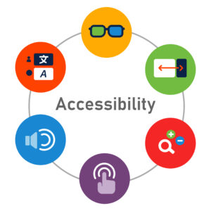
There are five types of disabilities Visual, Hearing, Neurological, Cognitive, and Motor Skills.
Visual Disabilities:
Site designers often overlook visual disabilities such as blindness, low vision, and color blindness. Either because they are unaware or think this isn’t an issue for their demographic. However, this is not the case. Low vision and eye conditions, such as cataracts, glaucoma, etc., affect more than 25 million people in the US alone. By 2050, it is expected to double.
Hearing Disabilities:
Hearing disabilities such as hearing impairments and deafness are a factor when you offer video or audio content to your users. Some issues seem obvious, like not being able to hear at all, but some conditions prevent people from distinguishing the important vocal parts and background noise due to sound contrast.
Neurological Disabilities:
Neurological Disabilities are conditions and disorders involving the central and peripheral nervous systems, such as epilepsy, Alzheimer’s disease, Parkinson’s disease, etc. Regardless of color, Flicker rates are one example of issues people with Neurological Disorders face.
Cognitive Disabilities:
Cognitive Disabilities include attention, learning disabilities, and logic. Individuals with these conditions may have issues with eye tracking, overly complex navigation, and more.
Motor Disabilities:
Motor disabilities include limited fine motor control, muscle slowness, and difficulty or inability to use hands. These individuals use assistive technology and voice controls to access websites.
So now that you have seen some of these issues, how do you address them with a website without it being a giant, expensive undertaking? There are quite a few things that you can do with ease. Here’s my list of low-cost and easy-to-perform accessibility tips.
- Color Contrast: I cannot stress this enough. Your text needs enough contrast that people with cognitive, neurological, and visual disabilities can read it. Plus, it makes it easier for everyone to read. Black text on a white background or white text on a black background has the ultimate contrast. If you want to use a color, make sure the contrast between the text and background is greater than or equal to 4.5:1 for small text and 3:1 for large text. Not sure if your color combination works? There are so many FREE contrast checkers, including this one https://coolors.co/contrast-checker/112a46-acc8e5
- Do not rely solely on color for visual cues: Some people cannot see some colors, making your site useless. For example, our ability to see blue diminishes as we age, so blue text links without underlines are an issue. Depending on the shade, they may not see the text at all. Also, some people have red/green colorblindness, so NEVER put those two colors on top of each other because they will cancel each other out. Other types of colorblindness make it hard to tell the difference between blue and green, yellow and red, purple and red, and yellow and pink.
- Centered Text: Do not center paragraphs of text. If you center text that is over two lines, many people will not be able to read it. When you read a page, your eye needs an anchor to scan the lines. Having the left alignment helps guide your eyes through the paragraph. It is helpful for people with Dyslexia and tracking issues. It also helps prevent eye fatigue. In addition, full justification causes similar issues, and it traps space between the words.
- Text in images or inaccessible PDFs: Pictures are worth a thousand words, but what if you can’t see them? Putting crucial information in an image means people using assistive technologies can’t read them. Therefore, put your information in text format and use alt-image tags to describe your images. It not only makes them accessible, but it is also suitable for SEO. For content that needs to be in a PDF, make sure it is accessible using Adobe Acrobat’s built-in accessibility checker. As a rule of thumb, if you cannot select the text and cut/paste it from the document, it can’t be read by assistive technology or search engines.
- Audio and Video: Everyone is making video and audio content right now. And it is excellent for people who want to watch a tutorial, listen to a podcast, etc. But not everyone can hear your content, hear it well or comprehend it. So, accurate subtitles and transcripts of your content are essential for those individuals. While YouTube makes subtitles, you should ensure they are correct because technology isn’t perfect. Also, ensure you have enough contrast so people can hear your voice clearly and distinctly. Reduce or eliminate background noise and make music lower when people are speaking.
- Simplify Navigation: Your navigation should be consistent on every page. It makes it easier for everyone to navigate your site, especially people with disabilities utilizing assistive technologies. Plus or minus seven menu items helps reduce cognitive load and allow all users to quickly and easily navigate your site.
- Spacing and Menu Items: Having menu items that are too close together can cause people to click on the wrong items. Make sure you have enough space between so that you can navigate the site no matter what device you’re using.
- Typographical Hierarchy: This is another important thing when it comes to content. Ensure your content has titles and subtitles to help people read it better. Chunk like information together helps with comprehension. It is also another SEO technique.
- Proper Spacing: Too often, the text is difficult to read because of spacing issues. These issues are caused by improper kerning, leading, and tracking. Kerning is the distance between two letters. Set too closely together; words are indecipherable; set too far apart, and they’re awkward to read.Tracking involves adjusting the spacing throughout the entire word. Once you’ve determined the proper spacing between each letter, tracking can be used to change the spacing equally between every letter at once, often if misused the text because squished or too far apart. Leading is the distance between the sentences. If you have it set too tight, the ascending and descending part of the letter will touch, making it difficult to read. Also, if the leading is too large, it becomes challenging for readers to find the next line in the paragraph.
- Pop-ups that are hard to close: Pop-Ups that are Difficult or Impossible to Close can be tricky for older individuals or people with motor skills or visual issues. Make pop-ups with straightforward navigation.
These are just a few ways to improve your website and make it easier for everyone to use, regardless of ability. I know this is a lot to read, and if you have any questions about your website, please feel to reach out.
Sources:
What is Web Accessibility & Why Is It So Important? – Monsido. https://monsido.com/web-accessibility
Color and contrast | Visual design | Accessibility for Teams. https://accessibility.digital.gov/visual-design/color-and-contrast/
