Color is everywhere. It’s used in traffic signs as visual clues, in art to convey symbolism, by hospitals to calm patients and in ceremonies to imply an emotion or meaning. Color is often the driving force behind design, but the wrong color can render a design unusable and even cause physical harm.
When humans perceive color it’s actually light waves hitting their eyes. These waves are translated into nerve impulses that their brain perceives as color (Dix, Finally, Abowd & Beale, 2004 pp 14.). The colors are distinguished by their frequency. Color perception is made up of hue, saturation and intensity. Hue is what most people define as color such as red, blue or green. Saturation is the intensity of the hue. For example, some hues can be vivid like magenta or pale like powder blue. A paler hue or a hue with low saturation is almost colorless while the highest saturated hues are the most vibrant. Another aspect of color perception is brightness, which is the amount of light or lack thereof (NASA, n.d.).
While most people can see color, eight percent of males and one percent of females have some sort of color vision deficiency ranging from the trouble distinguishing varying shades of colors to the inability to see any color at all (Colorblindness, n.d.). There are various reasons that people suffer from color vision deficiency including genetics, aging, eye disease and medications. One in forty thousand babies are born with no color vision at all. This genetic condition called Achromatopsia is an abnormality of the retina where the absence of cones causes the inability to see color. Achromatopsia suffers can see black, white and shades of gray. Through the use of dark, correct lens people with this condition can see and read, but it will not correct their color deficiency (Achromatopsia, n.d.).
The most common form of color deficiency is red-green variety where suffers cannot tell the difference between shades of red and green. Blue-yellow color vision deficiency cannot differentiate shades of blue and green. Unlike people who suffer from Achromatopsia, these two color deficiencies do not affect their visual acuity (Color Vision Deficiency, n.d.).
Recently there has been a significant increase in vision deficiencies due to the age. As the baby boomers continue to age we will see sharp increases in age related vision deficiencies. Some of the causes are due to changes in the optics. As lens become more yellow it makes it harder to distinguish shades of blue. This yellowing effect produces changes in color perception. Blue light becomes filtered causing blues to look darker. Purple looks more red since the blue pigments disappear therefore seeing a purple object on a red background is much more difficult as the person becomes older (Green, n.d.).
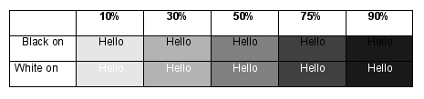
As lenses become less translucent, less light reach the photoreceptors, which make it more difficult to see. In addition, as you continue to age your pupils become smaller and less responsive to dim light. As lenses get cloudy with age contrast sensitivity continues to decline with the highest rate of impairment being in areas where there is low light. Their eyes also have a hard time adjusting to light to dark or vice versa. (Green, n.d.) When designing a website it is important that there is a significant amount of contrast between backgrounds and text as well as navigational elements. In the figure below it demonstrates how legibility decreases as contrast decreases (Collier & Cotton, 1989, pp57).
Often you hear stories about people with Epilepsy having seizures due to seeing a red flicker of light in a video game or animation. However only people who have photosensitive epilepsy, approximately five percent of people with epilepsy or one in four thousand people, have this type of condition. “Photosensitive epilepsy is the name given to a form of epilepsy in which seizures are triggered by flickering or flashing light”, according to Epilepsy Action, a UK based organization for people living with Epilepsy. Suffers are sensitive to flickering or flashing around 16-25Hz while some are sensitive to rates as low as 3Hz and as high as 60Hz (Photosensitive Epilepsy, n.d.).
Photosensitive epileptic seizures are triggered by both natural and artificial light with the most common trigger is the television due to refresh rate. Animation or dynamically refreshed content and high contrast patterns such as black and white stripes can also produce seizures. So it important to consider refresh rates and patterns when designing websites. Eliminating high contrast patterns, designing your animation with refresh rates higher then 60Hz and using technology such as AJAX for dynamic content are excellent preventive measures (Photosensitive Epilepsy, n.d.).
While the human eye sees 7,000,000 colors not all of them, especially when combined, are aesthetically pleasing. In fact, some can cause headaches, hurt your eyes and have adverse effects on your vision. Color can cause fatigue, decrease productivity, increase/decrease your appetite, agitate or stimulate the body. Color can have a calming or soothing effect on your mood. (Drunk Tank Pink, n.d.) Yellow, especially pure bright yellow, is the most fatiguing color due to its excessive stimulation of the eyes caused by its light reflecting qualities. While it is a great color, when used sparingly, as an accent or to grab attention, its irritating qualities make it a bad choice for webpage backgrounds at full intensity. Using softer, less vibrant versions of yellow can be soothing (Color Vision Matters, n.d.).
Other colors can have an effect on your appetite such as blue, which is considered to be an appetite suppressant. Some researchers say it is because you don’t see naturally blue food in nature, but it could also be because of the calming effect it has on the body. Blue has the opposite effect of the color red, which is considered to be an appetite stimulant. Red, an intense color, can make your heartbeat faster and your breathing heavier. Red attracts attention and is considered a great color for restaurants and their websites. Green is a popular color for a variety of reasons. It is said to be easy on the eyes, can improve vision, and has calming qualities about it. Hospitals use green rooms to calm patients and TV/radio stars wait in green rooms to relax before their appearances. For web-based applications that are used for several hours a day using pale greens can make it easier for the user’s eyes and less tiring (Johnson, n.d.).
Making your website accessible for people with color deficiencies and ensuring your visitors don’t have seizures are a given because it is the right thing to do and it is the law. In order to have a successful website that is usable therefore savvy web designer should make this an important aspect of their design repertoire and should consider having alternative color schemes as part of their usability-testing program.
References
Achromatopsia. (n.d.) Retrieved April 8, 2007 from:
http://www.aapos.org/displaycommon.cfm?an=1&subarticlenbr=60
Collier, David, Cotton, Bob (1989) Basic Desktop Design & Layout Cincinnati, OH:
Quarto Publishing
Colorblindness. (n.d.) Retrieved April 8, 2007 from:
http://www.preventblindness.org/eye_problems/colorvision.html
Color vision deficiency. (n.d.) Retrieved April 8, 2007 from:
http://ghr.nlm.nih.gov/condition=colorvisiondeficiency
Color Vision Matters. (n.d.) Retrieved April 8, 2007 from:
http://www.colormatters.com/optics.html
Dix, Alan, Finlay, Janet, Abowd, Gregory D., Beale, Russell (2004) Human Computer
Interaction. Singapore: Pearson Education.
Drunk Tank Pink. (1999) Retrieved April 8, 2007 from:
http://www.colormatters.com/body_pink.html
Green, Marc (n.d.) Visual Forensics of Older Drivers. Retrieved April 8, 2007 from: http://www.visualexpert.com/Resources/olderdrivers.html
Johnson, David (n.d.) Color Psychology. Retrieved April 8, 2007 from:
http://www.infoplease.com/spot/colors1.html
NASA’s Color Usage Research Lab. (n.d.). Retrieved April 8, 2007 from:
http://colorusage.arc.nasa.gov/color_concepts_1.php
Photosensitive Epilepsy. (n.d.) Retrieved April 8, 2007 from:
http://www.epilepsy.org.uk/info/photo.html
